
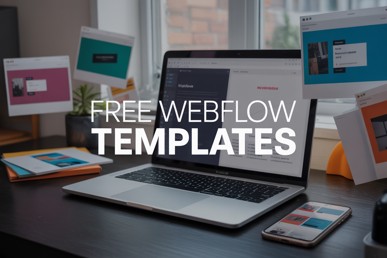
Best Free Webflow Templates for You: Pay Zero, Code Zero


Best Free Webflow Templates for You: Pay Zero, Code Zero
Building a professional website doesn't require coding skills or a hefty budget. Free Webflow templates offer non-designers, small business owners, and entrepreneurs a powerful solution to create stunning websites without writing a single line of code. This guide is designed for anyone who wants to launch a beautiful website quickly but lacks technical expertise or design experience. You'll discover why Webflow templates work so well for beginners, learn how to find high-quality free options that match your needs, and get practical tips for customizing your chosen template without getting overwhelmed. We'll walk through the entire process from selection to launch, plus share essential customization strategies that keep your site looking polished and professional.
Why Webflow Templates Are Perfect for Non-Designers

Skip the steep learning curve of traditional web design:
Building a website from scratch means mastering HTML, CSS, JavaScript, and understanding responsive design principles. For most non-designers, this represents months or even years of learning before creating anything remotely professional. Free Webflow templates eliminate this barrier
Traditional web design requires knowledge of:
- Code syntax and structure
- Design principles and typography
- Cross-browser compatibility issues
- Mobile responsiveness techniques
- Performance optimization
- User experience best practices
With Webflow templates, someone can have a stunning website running within hours instead of months. The visual editor allows users to make changes by clicking and dragging, while the underlying code remains perfectly structured. This means non-designers can focus on their content and business goals rather than getting bogged down in technical details. The platform handles all the complex backend work automatically. Database connections, hosting configurations, and security updates happen behind the scenes. Users simply customize the visual elements they see, making website creation as intuitive as editing a document.
Professional results without coding knowledge
Free Webflow templates deliver design quality that rivals expensive custom websites. These templates are created by experienced designers who understand current web standards, accessibility requirements, and conversion optimization principles.
Each template includes:
- Modern, clean aesthetics that appeal to today's users
- Proper typography hierarchies and spacing
- Optimized color schemes and visual consistency
- Professional animation and interaction effects
- Mobile-first responsive layouts
The templates automatically adapt to different screen sizes and devices. This responsive behavior, which typically requires advanced CSS knowledge, works flawlessly without any technical input from users. Professional designers have already solved the complex problems of making layouts look perfect on phones, tablets, and desktop computers. Many templates also include advanced features like contact forms, image galleries, and e-commerce functionality. These elements would normally require custom coding or expensive plugins, but they come built-in and ready to use.
Cost-effective alternative to hiring developers
Professional web development services typically cost between $3,000 to $15,000 for a basic business website. Custom e-commerce sites can reach $25,000 or more. Free Webflow templates provide similar functionality and visual appeal at zero upfront cost. The only ongoing expense is Webflow's hosting, which starts at reasonable monthly rates. Compare this to hiring developers who charge:
- $20-100 per hour for basic modifications
- $1000-2500 for custom features
- $1,000+ for ongoing maintenance contracts
Small businesses and entrepreneurs can allocate their budget toward marketing, inventory, or other growth activities instead of expensive development costs. The money saved can make the difference between launching a business or waiting indefinitely for enough capital.
Time-saving solution for quick project launches
Speed matters in today's competitive landscape. While custom development projects often take 2-6 months to complete, Webflow templates can be customized and launched within days.
This rapid deployment advantage helps with:
- Testing business ideas quickly
- Meeting tight deadline requirements
- Responding to market opportunities
- Launching seasonal campaigns or promotions
Free Webflow templates allow entrepreneurs to validate their concepts and start generating revenue while competitors are still in the planning phase. The ability to iterate and make changes quickly means businesses can respond to customer feedback and market demands in real-time. Many successful companies started with template-based websites and upgraded to custom solutions only after proving their business model. This approach minimizes risk and maximizes the chances of early success.
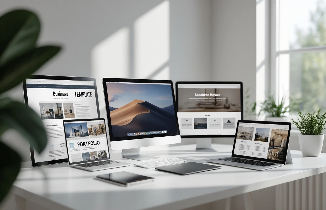
Top Categories of Free Webflow Templates
SaaS and Software Website Templates (SaaS / Software)
SaaS and software website templates are designed specifically for digital products, applications, and tech startups. These templates focus on clear product communication, feature highlights, and conversion-driven layouts that help turn visitors into users. Most SaaS templates include structured sections for product features, integrations, pricing plans, FAQs, and user testimonials. You’ll commonly find hero sections with strong value propositions, interactive feature blocks, and visually appealing UI previews that demonstrate how the software works. These templates often use modern design trends like gradients, subtle animations, and clean typography to create a polished, tech-focused feel. Many also include pre-designed pricing tables, comparison sections, and call-to-action blocks optimized for signups and demos. The strength of SaaS templates lies in their ability to simplify complex products. Whether you're launching a project management tool, AI platform, or CRM system, these templates help present your product in a clear and engaging way. Look for templates that include multiple landing variations, feature detail pages, blog sections for SEO, and integration showcases to build trust and credibility.
A clean and conversion-focused SaaS template designed for startups and tech products. Free Access: Opixo
Portfolio and Creative Showcase Designs (Portfolio / Creative)
Creative professionals need templates that let their work take center stage. Free Webflow templates in this category emphasize visual storytelling through large image galleries, smooth animations, and minimal text interference. These designs work perfectly for photographers, designers, artists, and creative agencies. Portfolio templates typically feature grid-based layouts that adapt beautifully to different screen sizes. Many include lightbox functionality for viewing images in detail and project case study pages that walk visitors through your creative process. The best portfolio templates balance white space with content, creating breathing room that highlights individual pieces. Animation plays a crucial role in creative templates. Subtle hover effects, scroll-triggered animations, and smooth page transitions add professional polish without overwhelming the content. These interactive elements help differentiate your portfolio from static websites while maintaining fast loading speeds.
Perfect for designers, developers, and freelancers who want to showcase their work professionally. Free Access: showly
E-commerce and Online Store Layouts (E-commerce or Online Store)
Online selling requires specific functionality that many free Webflow templates deliver surprisingly well. E-commerce templates include product showcase areas, shopping cart integration, and payment processing capabilities through Webflow's built-in e-commerce features. Product-focused templates emphasize high-quality image displays with multiple viewing angles and zoom capabilities. Category pages help organize inventory, while individual product pages include space for detailed descriptions, pricing, and customer reviews. Many templates also include wishlist functionality and related product recommendations. The checkout process gets special attention in quality e-commerce templates. Multi-step checkout flows, secure payment badges, and clear shipping information help reduce cart abandonment. Mobile optimization becomes especially important for e-commerce since many customers shop on their phones.
Designed to help startups launch quickly with strong messaging and modern UI. Free Access: Spacekit
Blog and Content-Focused Templates (Newsletter)
Content creators need templates that prioritize readability and easy navigation. Blog-focused free Webflow templates feature clean typography, logical content hierarchies, and intuitive categorization systems. These designs help readers focus on your writing rather than getting distracted by busy layouts. Most blog templates include author bio sections, social media integration, and newsletter signup forms to help build your audience. Comment systems and related post suggestions keep readers engaged with your content longer. Search functionality and tag-based filtering help visitors find relevant articles quickly. Content organization becomes crucial as your blog grows. Quality templates include archive pages, category listings, and featured post sections that highlight your best work. Many also support different post formats – standard articles, photo posts, video content, and quote cards – giving you flexibility in how you present information.
A clean blogging template optimized for readability and SEO-friendly structure. Free Access: Escape
Business and Corporate Website Templates (Business / Corporate)
Professional business templates form the backbone of the free Webflow template ecosystem. These designs focus on clean layouts, professional typography, and conversion-oriented elements that help companies establish credibility online. Most business templates include dedicated sections for services, team introductions, testimonials, and contact forms. You'll find templates specifically designed for consulting firms, law offices, accounting practices, and general service businesses. These typically feature hero sections with compelling calls-to-action, service grid layouts, and professional color schemes using blues, grays, and whites. Many include pre-built contact forms and pricing tables that you can customize without touching code. The beauty of these templates lies in their versatility. A template designed for a marketing agency can easily transform into a website for a real estate company or financial advisor with simple text and image swaps. Look for templates that include multiple page layouts – homepage, about, services, and contact pages are essential starting points.
A clean and conversion-focused Professional business template designed for startups and small businesses. Free Access: Spacekit
Essential Customization Tips for Non-Technical Users
Using the visual editor to modify layouts
Webflow's visual editor makes changing your template's layout feel like playing with building blocks. You can drag elements around, resize them, and completely restructure sections without touching a single line of code. Start by clicking any element on the page - whether it's a text block, image, or entire section. You'll see a blue outline appear around it, and the settings panel on the right will show all the customization options.
The key to successful layout modifications lies in understanding Webflow's flexbox and grid systems. When you select a container, look for the display settings in the right panel. Flexbox lets you arrange elements horizontally or vertically with automatic spacing, while CSS Grid gives you precise control over rows and columns. Most free Webflow templates use flexbox for their main layouts, making it simple to add or remove sections by duplicating existing elements and modifying their content. Pay attention to the structure panel on the left side of the editor. This shows you the hierarchy of your page elements, like a family tree. You can drag elements between different containers or reorder them within the same parent. This becomes especially useful when you want to move an entire section from the middle of your page to the top, or reorganize your content blocks for better flow.
Swapping out images and graphics effectively
Replacing images in your chosen template goes beyond simple drag-and-drop. First, always use high-quality images that match your content's purpose and your brand's aesthetic. When you click on an image, the settings panel shows options for the image source. You can upload new images directly or link to external sources. Size matters significantly for web performance. Before uploading, resize your images to match the dimensions they'll actually display at. A hero image might need to be 1920x1080 pixels, while a small icon only needs 64x64 pixels. Webflow automatically compresses images, but starting with appropriately sized files speeds up your site and improves user experience. Consider the file format carefully. Use JPEG for photographs and detailed images, PNG for graphics with transparency, and SVG for simple icons and logos that need to stay crisp at any size. Many free Webflow templates include placeholder images with specific aspect ratios. Keep these proportions when adding your own images to maintain the design's visual balance. Alt text becomes crucial for both accessibility and SEO. When you select an image, add descriptive alt text in the settings panel. This helps screen readers understand your images and gives search engines context about your visual content.
Updating navigation menus and page structure
Your navigation menu serves as your website's roadmap, so customizing it correctly makes or breaks user experience. In most templates, you'll find the navigation component in the header section. Click on the nav menu to see its structure in the Navigator panel. Each menu item typically consists of a link element inside a navigation wrapper. Adding new pages starts in the Pages panel on the left side of the designer. Create new pages by clicking the plus icon and naming them appropriately. Once you've created pages, return to your navigation menu and either duplicate existing nav items or add new link elements. Update each link's destination by selecting the link element and choosing the target page from the Link Settings panel. For dropdown menus, many templates include pre-built dropdown components. You can add new dropdown items by duplicating existing ones and updating their text and links. If your template doesn't have dropdowns but you need them, consider keeping your navigation simple - complex menus often confuse visitors more than they help. Page structure extends beyond navigation to include your overall content organization. Think about the user journey through your site. Your homepage should clearly communicate what you offer and guide visitors toward key actions. Use your template's existing section structure as a foundation, but don't hesitate to remove sections that don't serve your content needs.
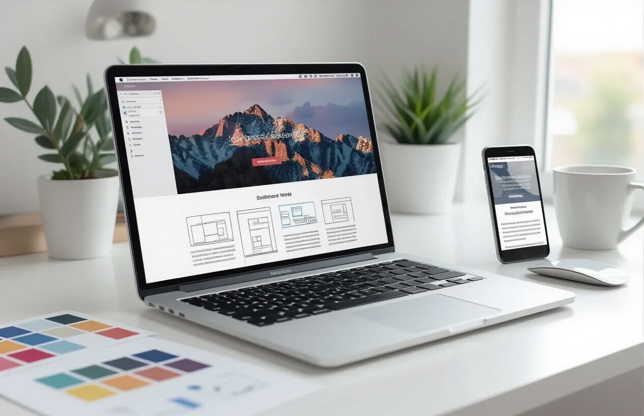
Optimizing for mobile responsiveness
Mobile responsiveness isn't optional anymore - it's essential. Webflow's responsive design tools let you see exactly how your site looks on different screen sizes. Use the device icons at the top of the designer to switch between desktop, tablet, and mobile views. Changes you make in smaller breakpoints won't affect larger ones, but modifications on larger screens cascade down to smaller ones. Start your mobile optimization by checking how text displays on small screens. Long headlines might wrap awkwardly, and body text could become too small to read comfortably. Adjust font sizes, line spacing, and margins for each breakpoint. Most free Webflow templates handle basic responsive typography well, but you might need fine-tuning for your specific content. Navigation becomes particularly important on mobile devices. Many templates automatically convert desktop navigation menus to hamburger menus on smaller screens. Test this functionality thoroughly - tap the hamburger icon to ensure the menu opens smoothly and all links work properly. If the mobile menu feels cramped, consider removing less important navigation items or organizing them differently. Images and media require special attention on mobile devices. Large hero images that look stunning on desktop might load slowly on mobile connections or appear cropped inappropriately. Use Webflow's responsive image settings to serve different image sizes for different devices. You can also hide certain decorative elements on mobile to reduce clutter and improve loading times. Test your site's mobile performance using real devices whenever possible. Desktop browsers' mobile simulation helps, but nothing replaces actually tapping through your site on a smartphone or tablet. Pay attention to button sizes - they should be large enough for finger taps - and ensure that all interactive elements work smoothly with touch gestures.
Common Pitfalls to Avoid When Using Free Templates
Over-customizing beyond your skill level
When you first discover Free Webflow Templates, the temptation to completely transform everything can be overwhelming. You see that sleek portfolio template and immediately think, "I'll just move this section here, change the entire navigation system, and rebuild the footer." Stop right there. This mindset leads to broken layouts, frustrated hours, and often a website that looks worse than the original template. Start small and work your way up. If you're new to Webflow, stick to basic customizations like changing colors, swapping out images, and updating text content. The template designer spent considerable time creating a cohesive layout that works well together. When you start moving major sections around without understanding how they interact with each other, you risk breaking responsive designs or creating visual inconsistencies. Focus on personalizing rather than rebuilding. Change the hero image to something relevant to your business, update the color scheme to match your brand, and replace placeholder content with your own. These changes alone can make a template feel completely unique to your brand without venturing into dangerous territory. If you do want to make more substantial changes, learn one element at a time. Maybe this week you figure out how to modify button styles, next week you tackle typography adjustments. Building your skills gradually prevents the frustration of tackling too much at once and ensures you understand what you're changing.
Ignoring licensing restrictions and attribution requirements
Not all Free Webflow Templates come with the same usage rights, and overlooking these details can land you in legal trouble or ethical hot water. Some templates require you to keep designer attribution links in the footer, while others allow complete removal of credits. Some are free for personal use only, while others permit commercial applications. Always read the licensing information before downloading any template. Look for details about attribution requirements, commercial use permissions, and redistribution rights. Many designers offer templates for free but request a simple backlink credit, which is a small price to pay for professional design work. Commercial vs. personal use distinctions matter more than you might think. A template that's free for personal blogs might require a paid license for business websites. Using a personal-only template for your consulting business could result in takedown notices or legal complications down the road. Keep records of where you downloaded templates and their specific licensing terms. Create a simple document that tracks the template name, designer, download date, and usage restrictions. This documentation becomes valuable if questions arise later about your usage rights. When in doubt, contact the template creator directly. Most designers appreciate when users clarify licensing questions rather than assuming permission. They often provide quick clarification and sometimes offer additional usage rights through simple communication.
Neglecting to test across different devices and browsers
Your template might look perfect on your laptop screen, but that doesn't guarantee it works well everywhere else. Modern websites need to function across desktop computers, tablets, smartphones, and various browsers. Skipping this testing phase can result in frustrated visitors who can't properly navigate your site. Start with responsive design testing using Webflow's built-in preview modes. Switch between desktop, tablet, and mobile views to check how your content adapts to different screen sizes. Pay special attention to navigation menus, image scaling, and text readability on smaller screens. Test your site on actual devices when possible. Emulators and preview modes are helpful, but nothing replaces seeing your website on a real smartphone or tablet. Ask friends or family to check your site on their devices and report any issues they encounter. Browser compatibility testing shouldn't be overlooked either. While modern browsers handle most websites well, subtle differences in rendering can affect your site's appearance. Test your website on Chrome, Firefox, Safari, and Edge at minimum. Pay attention to font rendering, button appearances, and any custom animations or interactions. Performance testing becomes especially important on mobile devices and slower internet connections. Large images or complex animations that work fine on fast connections might cause loading issues for other users. Use browser developer tools to check loading speeds and optimize accordingly. Document any issues you discover during testing and prioritize fixes based on how they impact user experience. A navigation menu that doesn't work on mobile phones requires immediate attention, while minor font differences between browsers can wait.
Conclusion
Free Webflow templates offer an incredible opportunity for anyone without design or coding experience to create professional websites. These templates eliminate the technical barriers that once made web design feel impossible for non-designers, providing ready-made solutions across countless industries and styles. You can find high-quality options through Webflow's official template gallery, community showcases, and trusted third-party resources, then implement them with just a few clicks.
The key to success lies in choosing templates that match your specific needs and taking time to customize them thoughtfully. Simple changes like updating colors, fonts, and content can transform a generic template into something that feels uniquely yours. Remember to avoid common mistakes like over-customizing, ignoring mobile responsiveness, or skipping the testing phase. With these free resources at your fingertips, building a stunning website has never been more accessible all you need to do is take that first step and start exploring what's possible.


